Everyone should consider combinations of Color and Moods when designing or branding their business. Also to establish an immediate message, color combinations should contain visual color cues that trigger specific responses. As a general rule, there should be a rank order of dominant, subordinate and accent colors.
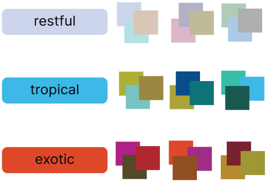
The color moods or themes to the right are illustrated in combinations of three. if more than three colors are appropriate, additional choices can be made from another color grouping within the same theme. As well as, some combinations, depending on the usage and the desired effect, may utilize only two colors.
There are no hard and fast rules about how many colors are appropriate in a combination. the final choice rests on the creators’ eye, but the mood of the piece will be determined by the chosen colors.
Let’s take a look how the following combinations break down into creating the desired mood set for the brands targeted clients.
Restful – This is a “zen” palette, passive rather than active, comprised of those colors that sooth and relax both mind and body. There are sage or pine greens, placid and/or twilight blues, wispy grays, therapeutic lavenders and misted mauves. All may be combined with purifying white for maximum healing.
Tropical – A tropical influence is found in the vibrant turquoises, aquas, ultramarines, and radiant blues reminiscent of ocean, sea, lagoon and sky. Also this group is exhilarating and refreshing. But the addition of the warmer greens add a more vibrant feel. While still offering an intriguing contract to the cooler blues.
Exotic – Just as exotic destinations should arouse the promise of the unexpected. The intrigue, adventure and mystique of far away places. Exotic colors must speak to uniquely different color combinations. Ones that seem to reflect a mix of multi-cultural means and messages. Exotic embraces vibrancy and complexity in the mix of spicy warm tones.
Such as curried gold, tandori reds, ginger and tawny olive olive greens. Also including sensual fuchsias, red purples and ebony black. Metallic glimmers of copper, bronze and gold could also be added for a distinct glow.
Color can not only move people on an emotional level, but it is also a “moving element that can stimulate an action or reaction. Which results in causing people to move in a desired direction.
View some of the brands that we at Hester Designs have helped established and pay attention to their colors. See how it could affect a viewers mood. An excellent printed resource to help you when determining your mood and colors would be the book, COLOR: messages and meanings.
