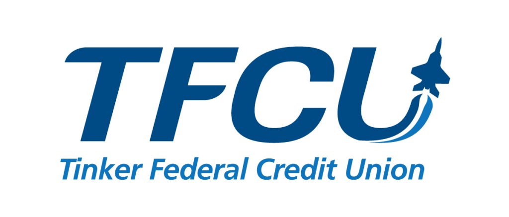
Sometimes we like to to take some free time, and do a little “hypothetical design” project. This isn’t a real project. It helps us explore design we come into contact with everyday. Maybe see how we can improve on an existing design. For this project, we decided to have some fun with Tinker Federal Credit Union’s logo.
This logo has been around for a very long time. It was probably designed even before computers helped designers with creative projects. So we decided to dive in and see how we could evolve this logo, and make it something maybe a little clearer or more modern.
All in all this was a fun exercise. If this project ever comes our way, this may not be the way we go with it, but it is just one idea of how a logo can evolve.
Share on facebook
Facebook
Share on twitter
Twitter
Share on linkedin
LinkedIn
Share on pinterest
Pinterest
Share on email
Email
Share on print
Print
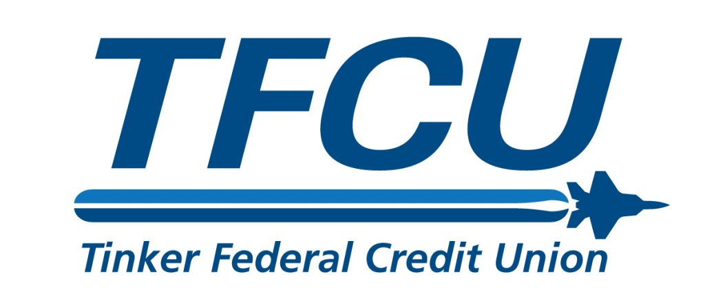
The original logo:
This logo has to be aligned by sight. It leans to the right. It’s also a little hard to read.
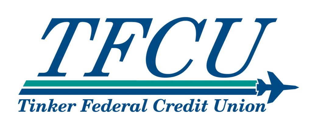
Our first stage:
The first things we do is adjust the font. Give it some nice spacing. Change the angle slightly for clarity. Kerning the text below really helps.
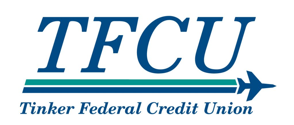
Our second stage:
Next we modernize the lower font. This brings it closer to their modern brand. We also add a plane silhouette that is up-to-date.
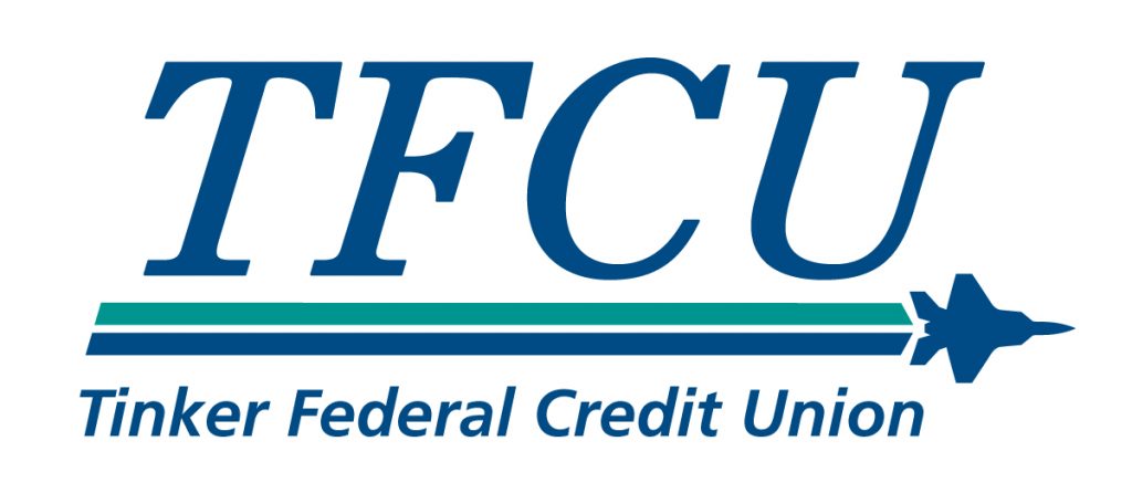
Our third stage:
Now we modernize the top font. We add some action to the vapor trail element. We also change the colors slightly.
Our final stage:
The stage simplifies and brings it all together. Readability improves as well.
